A website can have clean code and reliable hosting but still feel slow because its images take too long to appear. Large product photos, oversized blog covers, uncompressed screenshots, and unnecessary image downloads can all delay the content visitors came to see.
Learning how to improve image loading speed of a website does not mean making every picture blurry or removing useful visuals. The goal is to send the browser the right image, in the right format and size, at the right time.
Start by checking which images are causing problems. Then resize them, compress them, and choose a suitable format. These changes can reduce unnecessary downloads without sacrificing the quality visitors need.
Why Are Images Loading Slowly on Your Website?
Images can account for a large share of the data a webpage downloads. A photo taken with a modern phone might be several thousand pixels wide, even when it appears as a small thumbnail on your website.
Common causes include:
- Oversized images: The files contain more pixels than the page needs.
- Inefficient formats: A large image could be delivered more efficiently in another format.
- Missing responsive versions: Mobile visitors download unnecessarily large images.
- Incorrect loading behavior: Important images load late, or offscreen images compete for bandwidth.
- Poor delivery setup: Images are not cached efficiently or take a slow route from the server to the visitor. The best fix depends on the actual cause. Installing another optimization plugin or converting every image to WebP will not automatically solve every image-related performance problem.
1. Find the Images Causing the Problem
Before changing anything, identify which images are slowing down your page.
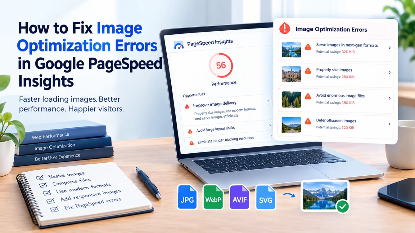
Open Google PageSpeed Insights (opens in a new tab) and test the exact URL you want to improve. Check both mobile and desktop results, then inspect the image-related recommendations and the listed image files.
You may see an Improve image delivery insight, which brings together several image optimization opportunities, including oversized files and inefficient formats.
Pay particular attention to images with substantial estimated savings. If the page's Largest Contentful Paint (LCP) element is a large hero image or article cover, optimizing that specific image may matter more than compressing a tiny icon near the footer.
Record the warning and the image URL before making changes. That way, you can test whether your fix actually resolved the reported problem.
2. Resize Images to the Dimensions Your Website Needs
One of the simplest ways to improve image loading speed is to reduce unnecessary image dimensions.
Imagine uploading a 3,000-pixel-wide photo for a content area that displays it at 720 pixels wide. CSS can make the image appear smaller, but the browser may still download the larger file.
Resize the source image to dimensions suitable for its intended use. Also account for high-resolution screens, which may need a larger source than the displayed CSS width.
| Image use | Sensible starting point |
|---|---|
| Small thumbnail displayed at 160px | Around 160px to 320px wide |
| Blog image displayed at 720px | Around 720px to 1,440px wide |
| Large desktop hero | Match the actual layout and responsive requirements |
These are starting points, not universal rules. The right dimensions depend on your layout and the image's purpose.
You can use the Serynix Image Resizer to adjust an image's pixel dimensions before uploading it. Choose the target dimensions carefully and preview the result to make sure the image is not cropped or distorted.
For websites with many images, automatically generating multiple sizes can save time and help mobile visitors avoid downloading desktop-sized files.
3. Compress Images Without Noticeable Quality Loss
Resizing removes unnecessary pixels. Compression reduces the data needed to represent those pixels. Using both often works better than either alone.
For photographs, lossy compression can reduce file size considerably while maintaining acceptable visual quality. Lossless compression preserves the original image information but may offer smaller savings.
Here is a practical workflow:
- Keep a copy of the original.
- Resize the image to suitable dimensions.
- Compress the resized file.
- Compare the result with the original at its actual display size.
- Check details, text, edges, and faces before publishing.
You can use the Serynix Image Compressor to adjust compression quality and compare the result before downloading it.
Do not keep compressing just to achieve a smaller number. A screenshot that becomes difficult to read or a product photo that loses important details may not be worth the savings.
File size also depends on the image. A full-width photograph and a small icon have different requirements, so there is no single file-size limit that guarantees fast loading.
4. Choose the Right Image Format for Website Speed
The best image format depends on what the image contains. Converting every image to the same format is not always the right approach.
| Format | Best suited for | Important consideration |
|---|---|---|
| JPEG | Photographs | Widely supported, but modern alternatives may be smaller |
| WebP | Photos and many web graphics | Offers efficient compression and broad browser support |
| AVIF | Detailed photographs and web visuals | Can provide excellent compression, but test quality and compatibility |
| PNG | Certain screenshots and transparent graphics | Can be unnecessarily large for photographs |
| SVG | Logos, icons, and vector illustrations | Scales cleanly, although complex SVG files can still be large |
For many websites, WebP is a sensible choice for photographs and illustrations. AVIF is also worth testing when it provides a smaller file without unacceptable quality loss.
You can convert a supported image using the Serynix Image Converter. Select WebP as the output format when it is available, then compare the converted file with your original.
Remember that changing the format does not guarantee a smaller file. The converter changes the image encoding, but the resulting size depends on the source image and output settings. If the converted image is still too large, compress it separately and compare the results.
Do not rename photo.jpg to photo.webp and expect the image to convert. Changing a filename extension does not change the file's actual format.
For websites where you control the HTML, the <picture> element can offer alternative formats with a fallback. If your CMS or image delivery service already handles format selection, check its settings before introducing another conversion system.
5. Serve Responsive Images to Mobile Visitors
A responsive layout does not automatically mean your images are responsive.
If the same large image is sent to every visitor, someone on a small phone may download much more data than necessary. Responsive images allow the browser to choose from several available file sizes.
For example:
<img
  src="/images/article-800.webp"
  srcset="
    /images/article-400.webp   400w,
    /images/article-800.webp   800w,
    /images/article-1400.webp 1400w
  "
  sizes="(max-width: 600px) 100vw, 800px"
  width="800"
  height="533"
  alt="A mountain lake surrounded by trees"
/>
Here, srcset lists image versions, while sizes describes the space the image is expected to occupy. The browser uses that information to select a suitable source.
The width and height attributes also help reserve space before the image finishes downloading, reducing unexpected page movement.
If you use WordPress or a modern web framework, check whether responsive image generation is already available. Use existing capabilities where possible rather than maintaining several manual versions of each file.
6. Use Lazy Loading Without Delaying Important Images
Lazy loading delays the download of an image until it approaches the visible area. This can help pages containing many product photos, screenshots, or related-content thumbnails.
For an image lower down the page, native browser lazy loading is often sufficient:
<img
  src="/images/related-guide.webp"
  loading="lazy"
  width="800"
  height="533"
  alt="A related website performance guide"
/>
However, there is an important exception: do not lazy-load your main above-the-fold image when it is the page's LCP element.
Adding loading="lazy" to a prominent hero image or article cover can delay its download. Instead, let the browser discover important visible content early. Developers can sometimes use fetchpriority="high" to prioritize the main image, but this should be applied selectively.
The principle is simple: load important visible content early and defer images visitors have not reached yet.
7. Prevent Images From Shifting the Page
Have you ever started reading an article, only for the text to jump down when an image appears? This can happen when the browser has not reserved enough space for the image.
Include suitable width and height attributes or define a stable aspect ratio in CSS.
.article-image {
  display: block;
  width: 100%;
  height: auto;
}
This lets the image fit its container while preserving its proportions. Combined with correct intrinsic dimensions in the markup, it helps the browser allocate space before the image loads.
This step does not compress the image, but it can improve visual stability and reduce layout shifts.
8. Check Caching and Image Delivery
If images are already small and correctly sized but load slowly, investigate how they reach the browser.
A content delivery network (CDN) can serve cached files from locations closer to visitors. Browser caching can also prevent repeat visitors from downloading unchanged files unnecessarily.
Your website setup matters:
- WordPress: Check your theme, image optimization plugin, and CDN settings. Avoid overlapping plugins that repeatedly process the same images.
- Next.js or another framework: Check generated image sizes, responsive source selection, caching, and whether images are being optimized as expected.
- Custom HTML: Inspect image requests, response sizes, caching headers, and loading priority in your browser's developer tools. A CDN cannot make an unnecessarily large image efficient unless image resizing or optimization is also configured. Fix the source image first, then improve delivery.
9. Retest Your Website After the Changes
After making changes, test the same URL again. Do not assume the issue is solved just because the image looks smaller in your browser.
Use this checklist:
- The largest images have appropriate dimensions.
- Photographs use efficient formats and acceptable compression.
- Mobile visitors receive suitably sized images.
- Images below the fold are lazy-loaded where appropriate.
- The main visible image is not unnecessarily delayed.
- Image dimensions prevent unexpected layout shifts.
- Updated files are being served instead of older cached versions.
Run PageSpeed Insights again on mobile and desktop. Scores can vary between runs, so compare the specific warnings, estimated savings, and performance metrics instead of chasing a perfect score from a single test.
For further technical detail, consult Chrome's Improve Image Delivery guide (opens in a new tab).
Common Image Speed Problems and Their Fixes
| Problem | What to check first |
|---|---|
| The page is slow despite compressed images | Check dimensions, LCP, loading priority, and delivery |
| Mobile visitors download large images | Provide responsive versions using srcset and sizes |
| The main image appears late | Check lazy loading and image discovery |
| The page jumps as images load | Set image dimensions or a stable aspect ratio |
| WebP conversion creates a larger file | Compare formats and retain the smaller suitable version |
| PageSpeed still flags images | Inspect the specific files and prioritize the largest estimated savings |
Frequently Asked Questions
How can I make website images load faster without losing quality?
Resize images to suitable dimensions, then test compression and compare the result at its actual display size. WebP or AVIF may reduce photographic file sizes, but the best choice depends on the image and your delivery setup.
Should every website image be converted to WebP?
No. WebP is useful for many photos and graphics, but SVG may suit logos, PNG may suit certain transparent graphics or screenshots, and AVIF may be worth testing for photographs. Choose a format based on the content.
Does lazy loading improve website speed?
It can reduce competition for bandwidth by delaying images outside the visible area. Applying it to the main image that determines LCP can have the opposite effect, so loading behavior should depend on the image's position and importance.
Why does PageSpeed Insights still report image problems after compression?
The file may still be too large for its displayed dimensions, a responsive version may be missing, or the browser may be downloading an inefficient format. Inspect the listed image instead of repeatedly compressing it without checking the cause.
Final Checklist
The most reliable way to improve image loading speed is to optimize the entire delivery process, not just file size. Resize images, compress them carefully, choose suitable formats, serve responsive versions, prioritize the main image, and lazy-load content below the fold.
Make the changes with the biggest estimated savings first, then test the page again. That gives you a more useful result than blindly converting every image or chasing a perfect PageSpeed score.